Charts is only available on Business tier plans.
Chart types
Charts are the building blocks of Hightouch's Intelligence features. We currently support several chart types:
- Insights: Analyze audience composition, breakdowns, and performance.
- Funnels: Identify drop-off points across a sequence of events.
- Splits: Measure results of experiments between randomized groups.
Key elements
While the analysis varies between chart types, the general anatomy stays consisent across them.
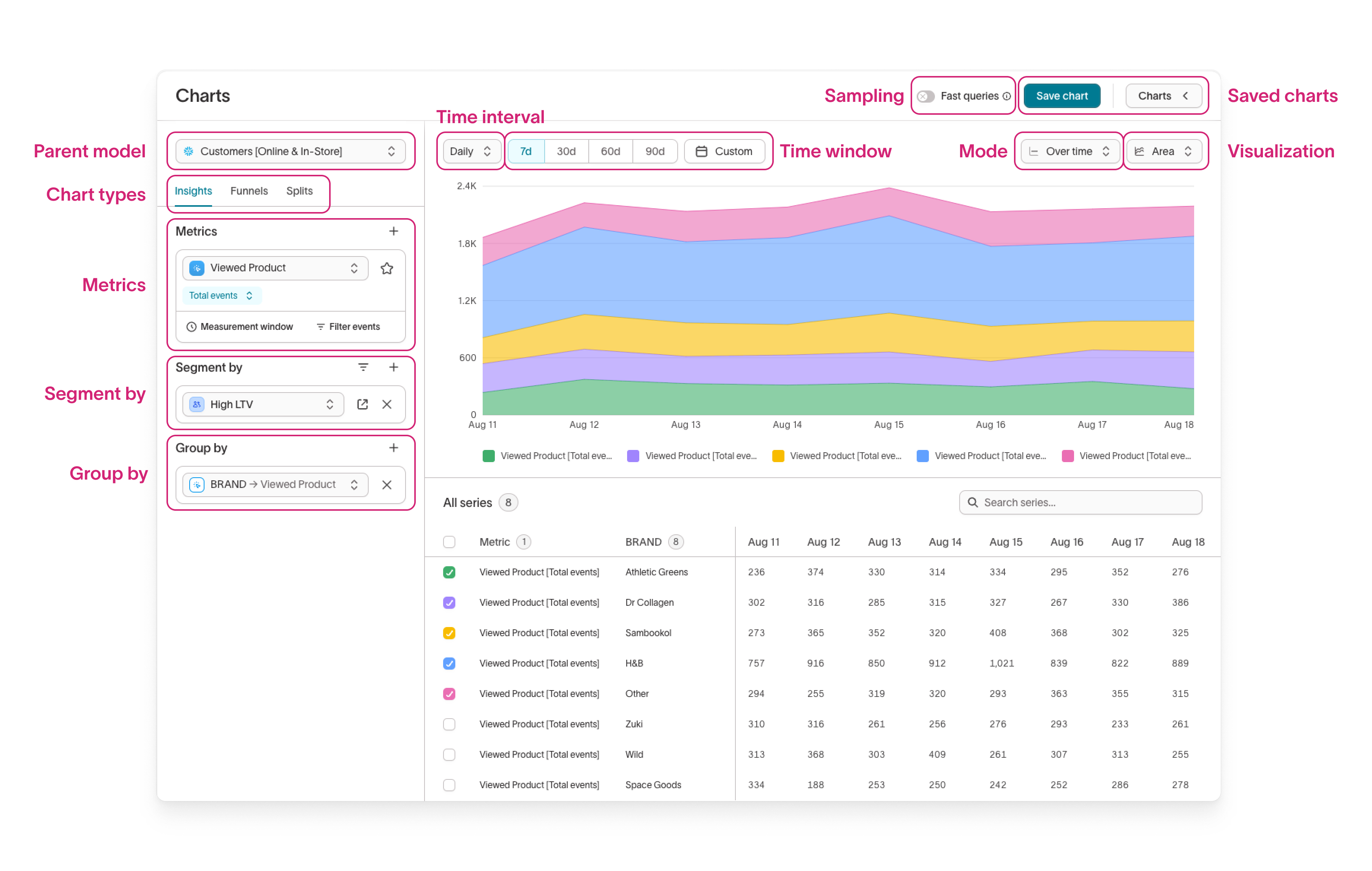
- Parent model: The dataset for your analysis, defined in the schema setup step.
- Chart type: The analysis type (Insights, Funnels, Splits).
- Metrics: An aggregation over events. Metrics can have an aggregation type, filters, and an attribution window. Metrics can be on the cohort level (sum of purchases for all users) or on the user level (average purchase amount per user).
- Segment by: The segment of users to include in the analysis. Default is to include the entire parent model. You can select multiple existing audiences or create inline audiences. If using an attribution window, events are only included if the user falls within the attribution window for the audience-metric pair.
- Group by: The dimension to breakdown a metric by. There are several types of dimensions:
- User properties: Attributes, traits, or merge columns of a user. Examples: gender, state, loyalty status
- Event properties: Attributes on the specific event. Examples: brand, campaign, utms.
- Related properties: Attributes on a related model. Examples: item, item property.
- Time interval: Time granularity for metric rollup (daily, weekly, monthly). For example, sessions from distinct users per day = DAU, per week = WAU.
- Time window: The time period for analysis. Events outside this window won't contribute to metrics.
- Saved charts: Drawer showing all saved charts across the workspace.
- Sampling: For parent models that have Sampling turned on, enable
Fast queriesto query a sampled percentage of your parent model. - Mode: The type of data aggregation (
Over timeorCumulative) when viewing time-series charts (Line, Column, and Area). - Visualization: The type of data visualization (Line, Column, Area, Bar, Table, Heat map, Number).